

Texio
a mobile ticketing app
CONTEXT
Texio is an in-progress project nearing completion as part of the Google UX Design Certificate course. The design challenge is a prompt from sharpen.design.
THE PROBLEM
A movie theater in Texas needs a mobile app that allows audiences to purchase tickets.
THE GOAL
To design a fast, easy, and enjoyable mobile ticketing experience for Texan moviegoers.
MY ROLE
This is a solo UX Design project.
Understanding the user
I conducted surveys of moviegoers in Texas, followed by some informational interviews, to get a clear idea of their pain points and build a persona.
The vast majority of folks surveyed reported a general overall satisfaction with their mobile ticketing experiences, save for a few common frustrations.
PAIN POINTS

PERSONA: Cam Vega, Brand Manager

PROBLEM STATEMENT: Cam is a Brand Manager with two kids who needs a fast, enjoyable way to purchase movie tickets because his free time is precious.
JOURNEY MAP

Cam has a demanding job and a busy life, so convenient navigation and checkout functionality is going to be essential.
Defining the problem
With the pain points established, I began to hone the scope of my design with a “how might we” statement.
How might we design a mobile ticketing platform for Texan moviegoers that allows them to quickly and conveniently find showtimes, learn about new releases, reserve their seats, and buy their tickets?
HEURISTIC & COMPETITIVE ANALYSIS
I identified a few direct and indirect competitors: Cinemark, Alamo Drafthouse, City Lights, and Central Cinema, and ran analyses on their mobile platforms and ticketing processes. Cinemark had the most “feature complete” mobile experience, so its functionality sets the design standard, though its pricing model with “convenience fees” for online ticket purchases sours users. Given that pricing isn’t necessarily a design consideration for this project, I’m not going to account for those fees in my design beyond noting the clear pain point.
You can view the full spreadsheet here, and the report here.
Starting the design
In this phase, I created a user flow, storyboards, sketches, and wireframes.
USER FLOW
This is how Cam might use Texio to buy movie tickets.

PAPER WIREFRAMES
The user flow helped me sketch out a series of paper wireframes to start exploring and organizing the design.

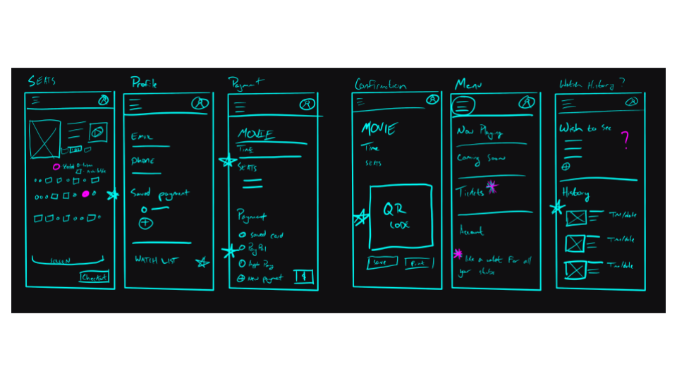
I tend to use Procreate on an iPad Pro to sketch. Layers are powerful tools, and they save trees.
DIGITAL WIREFRAMES
I put all the sketches together and went to work in Figma


Prototyping
The prototype allows the user to browse movies, view their profile, select seats, and purchase tickets.
Click the image, or click here to view the prototype.
Usability studies
I conducted 15 minute moderated, in-person usability studies to test the prototype. The participants were 3 females and 2 males between the ages of 24-58, and after the sessions participants completed a System Usability Scale. The insights from the session will inform the next iteration of the design.
FINDINGS
Users need a more intuitive way to find their tickets.
Users need a more robust checkout process.
The design was a little visually cramped for some users.
Refining the design
I adjusted the design based on the findings from the usability tests and started slapping on coats of paint, beginning the high fidelity visual design.
MOCKUPS


RESPONSIVE DESIGN
I created my design to be responsive and scalable across devices and platforms.

HIGH-FIDELITY PROTOTYPE
The hi-fi prototype lets users buy a ticket to Spider-Man: No Way Home, and features redesigned navigation and UI. You can view it below or using this link.
ACCESSIBILITY
In trying to solve one problem, I created another. I thought adding bright, saturated colors would make things pop, but the design features problematic contrast and color choice which may make it unusable for colorblind users. The next step will be to correct the colors to be in line with WCAG and W3C guidelines.
In addition to colorblindness, some users report the contrast to be tiring, so that needs to be changed in a future iteration.
Takeaways
NEXT STEPS
The first thing I would do going forward with this project would be to improve the accessibility of the design, because the colors I chose turned out to be problematic. I will likely do this, but since this is a project for a certification program, I won’t be iterating much further on it, save a few feature tweaks here and there (I’d like to learn how to get a calendar working in Figma, so that might be something I add in the future).
REFLECTION
Visual and UI design may have been latent passions in me, and I can’t wait to learn more about that world. I also built a more robust understanding of design systems and sticker sheets, which has significantly improved my workflow.
Going forward, I will be considering accessibility from the very beginning of all my designs.
Additionally, you can view the presentation deck here.